Here is how your are going to organize your answer using the graph you created for your homework:
1 Introduction (Here you say what the diagram is about. )
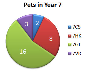
The pie chart is about the pets in Year 7. The chart is divided into 4 parts and each part represents one class of Year 7.
2 Message of the diagram
The largest number of pets are in form 7GI. There are 16 pets.
The second largest number of pets are in form 7HK. There are 8 pets.
So there are more than twice as many pets in form 7GI.
The chart shows that there are only 2 pets in form 7CS and 3 in form 7VR.
3 Conclusion
So we can say that the most pets of Year 7 are in form 7GI and the least in form 7CS. There are more than 50 per cent of all the pets in one form - form 7GI.
Summary
The pie chart is about the pets in Year 7. The chart is divided into 4 parts and each part represents one class of Year 7.
The largest number of pets are in form 7GI. There are 16 pets.
The second largest number of pets are in form 7HK. There are 8 pets.
So there are more than twice as many pets in form 7GI.
The chart shows that there are only 2 pets in form 7CS and 3 in form 7VR.
So we can say that the most pets of Year 7 are in form 7GI and the least in form 7CS. There are more than 50 per cent of all the pets in one form - form 7GI.
Source:
http://www.englisch-hilfen.de/en/words/charts.htm